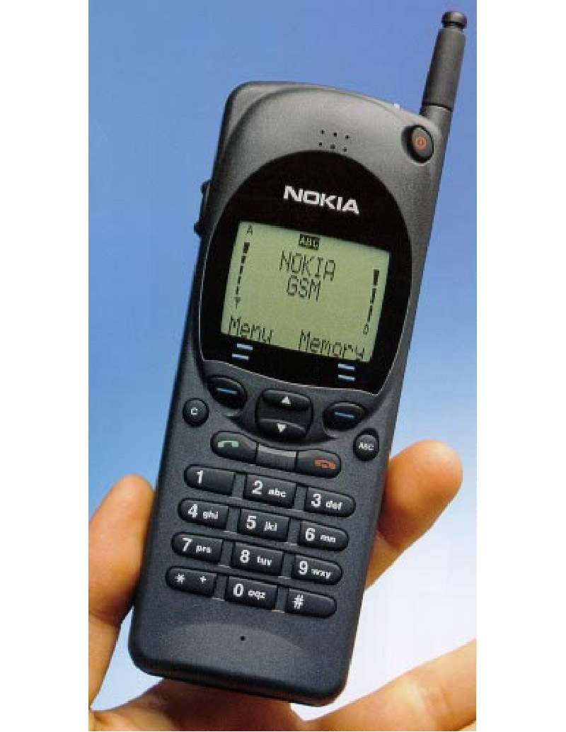
Twenty years ago (give or take a few weeks) Nokia announced a new mobile phone that was to cement its early leadership in the mobile phone market
The Nokia 2110 went one to become not just one of the best selling top-end
handsets of its time, but also defined how a mobile phone should look if it
wants to appeal to business users.
In an era of clunky large handsets with small screens and deep batteries, the
Nokia 2110 was a revolutionary product — sleek, slender and stylish.
The subtle curves around the screen and the small size of the antenna added
to its appeal, and the — by the standards of the time — large four line
dot-matrix display screen was larger than almost anything else on the market.
It was however the size of the phone the caused the greatest excitement as
the phone was exceptionally thin compared to its thicker cousins, and while you
could stack several iPhones next to it today, it still felt surprisingly
comfortable when carried in a jacket pocket.
It was also one of the very first handsets that were able to send text
messages — although few used it at the time as most other handsets were receive
only models.
It was also the first model Nokia released with the now classic Nokia tune as
a ringtone. The tune comes from a classical guitar work called Gran Vals,
composed by Francisco Tarrega in the 19th century.
An exceptional 30 hour standby was offered from the battery, or over 2 and
half hours of talk time. This was at a time when carrying a spare battery around
was common place for heavy users of mobile phone such was the short duration of
their life.
We have been unable to find out exactly when the handset was announced. It
was certainly some time in January 1994, although the earliest news reports we
can find date to early February 1994. Nokia’s own archive doesn’t go that far
back, and even their financial accounts don’t mention it.
Later superceded by the 2110i, which had a few performance improvements, and
was also the base for customised models sold to other operators, it was the
launch of the original handset that shook the mobile industry into looking at
the design of the phones as an essential part of their engineering.
The subtle curve on the front that gave them space to add a decent rubber
keypad accentuated the curved of the screen and the facia. It made the phone
something that people when they first picked one up something they would want to
caress.
Probably the one thing that secured a decade or more of loyal Nokia fans
though was the software inside the phone. At a time when menu functions required
a prodigious memory for strange key press combinations, the Nokia 2110
introduced a text based menu that could be navigated through.
Underneath was still a code-based system, but at last there was a way of
using the phone written in a simple language that was easy to understand.
However, what kept Nokia users loyal was that future handsets right up to fairly
recent times maintained the same underlying menu structure. Once you learnt to
use one Nokia phone, you could use any Nokia phone.
That was a marked contrast to other handset manufacturers who seemed to
change menu options as often as fashions changed dress lengths.
The Nokia 2100 series went on to sell 20 million phones worldwide. Nokia’s
target had originally been circa 400,000.


